The PIO Forum
By Pam Frost Gorder
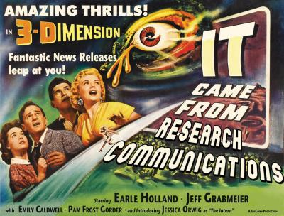
Sid Caesar once said that comedy has to be based on truth. By that measure, the humorous cover design of the 2011 annual report for Research Communications at Ohio State was based on the truth that the four of us then on staff — Earle Holland, Jeff Grabmeier, Emily Caldwell, and myself — are, fundamentally, extreme personalities.
We are actually quite well balanced, if you consider that our dead-serious commitment to excellence in science communication is countered only by our insatiable appetite for puns, jokes, and general silliness. Or, as one of our interns once said with some amazement, “I’ve never seen people who are so passionate about their work, but at the same time find so much humor in it.”
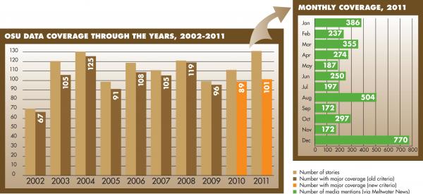
The substance of our annual report is, in fact, not funny at all. It’s a detailed analysis of the news releases we produced during the year and the coverage they received. Like any annual report in industry or academia, it tells stakeholders (in this case, university leadership) that we’re doing a good job, and (hopefully) drives home the point that we should be allowed to continue to exist. This year, we decided to wrap that medicinal message in the sugary coating of a cover image of a vintage sci-fi B-movie. The results went beyond what we expected. Our audience expanded beyond leadership to include friends, family, and colleagues.
I have to admit that the idea to publish the report on the web for the first time this year was partially based on my laziness. The assembly of the report has always been my job, and I loathe the tedium of creating a print layout. I also mourn the trees that lose their lives so that I can annually print dozens of copies of a sometimes 20-page document.
Further, I questioned whether anyone ever read the whole thing, and wondered if we couldn’t capture more of our target audience in leadership if they could simply click on a link in an email to read it. A web report would be dynamic, I thought — we could link to our actual stories and the resulting clips to demonstrate that our achievements are concrete.
Likewise, the idea to construct a sci-fi cover was born out of my need to take a break from mind-numbing data analysis. The hours I spent here and there photo-shopping an old movie poster provided the playtime that kept me sane during a month of report production. We’ve always featured some kind of art on our cover — a word cloud, a map, or even a funny cartoon — and so the notion of a movie poster only seemed to carry our whimsy just a little bit further. Besides, Earle loves B-movies, so I knew he would approve.
Over the years, the length and content of the report have varied, depending on the disposition of our vice president for communications. We’ve seen VPs come and go. Some wanted a report that detailed every news clip we could track, while others were happy with a bare-bones list of stories with a checkbox to indicate whether each received national coverage or not. A particularly corporate-minded VP inspired us to write an executive summary so that he would have to read no further than the first page. Another who seemed particularly engaged with our methods inspired us to discuss in more detail what we do, and how we do it.
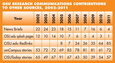
Still, our means of crafting the report has remained basically the same. We each make note of clips that our own stories generated and Emily tallies the various ways that our stories were used by different communications units internal to the university. Then we add up the raw numbers. Or, rather, I add up the numbers over and over again on computer and in pencil until I get the same answer more than once, then have Earle check my math.
We’re doing our regular jobs all this time, so we make headway whenever we can carve out a few hours to work on our story lists. With all the web searching, counting, gnashing of teeth, and sharpening of pencils, this process takes about two weeks.
Then for about a week I retreat into my cube to write a seat-of-the-pants analysis of how we did. I periodically share the analysis with Jeff, Emily, and Earle, and get a sense of our best accomplishments, and things we want to do better. I examine Pew Research Center surveys and such to get a sense of how our communications strategies fit into national trends. During this dark, dark time for me, my three colleagues construct lists of their professional activities for the year, which we add as appendices to the final report.
Then it’s a matter of compiling all that information, making sure that it reads well, and formatting it to look pretty. Emily, Jeff, and Earle each take turns editing the final draft. That week rounds out our month-long effort.
This year, with Earle’s permission, I set about putting the report on the web. One of our new-media editors helped me install Wordpress on our server, because I already knew how to use it. I picked a free template that I’d used a few times before, because it allowed for a slideshow. The process took a couple of days of solid work, with me installing plug-ins to Wordpress to sort and display our data. I even did a tiny bit of CSS coding to make the slideshow run just right. I was so proud.
The response to our B-movie cover theme from senior leadership was positive. Our latest VP had just started her job when Earle showed it to her. He later described her expression as a few seconds of confusion, followed (blessedly) by laughter. Others around the university, in the administration, and in the Office of Research saw it and passed along compliments. Earle shared this feedback with some NASW colleagues, who also had very kind things to say. That exposure, in turn, led to an offer for me to write this column.
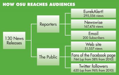
Since Feb. 13, Google Analytics indicates that the site has received 225 visits from 114 unique visitors, with a bounce rate of about 50 percent. That means that people have returned to see the landing page again, and — (gasp!) — half of the time, they actually stayed to read the report (or at least part of it).
Of course, when I proposed the website to Earle, he immediately knew the larger implication of that decision. Other universities would now be able to see exactly how many stories we write in a typical year, and how many get coverage. Our batting average would become public knowledge. None of our colleagues, even those in public universities, shares that information, as far as we know. We’re not afraid to put our numbers out there. Our hope is that other universities will follow suit, because we believe that we can all learn from each other’s successes and failures. In the end, we hope we can all become better at informing the public about the important research going on at our universities.
Pam Frost Gorder is assistant director of research communications at Ohio State University.
.png)